
UNDERSTANDING COLOUR PSYCHOLOGY IN INTERIOR DESIGN
Upon entering a room, the immediate emotional response—whether it’s calmness, energy, or even discomfort—can be heavily influenced by the colours used in the space. In interior design, colour plays a critical role in setting the tone and atmosphere of a room. It’s an art form that combines a person’s personality with their preferences, resulting in a space that truly reflects who they are. Colour psychology in interior design delves into how different hues impact human emotions and behaviours, and how strategic use of colour can transform a space.
What is Colour Psychology in Interior Design?
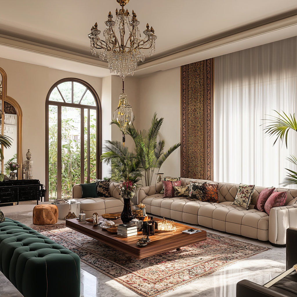
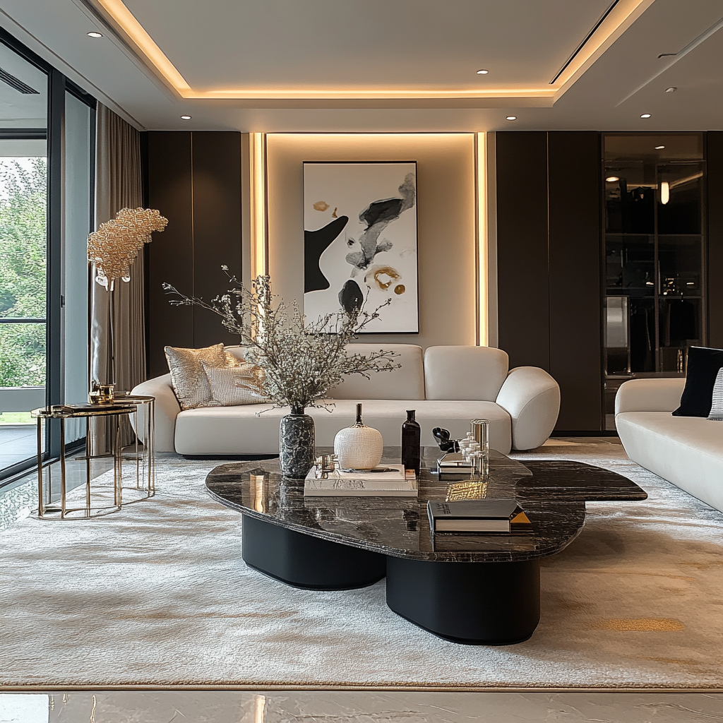
Colour psychology in interior design examines how specific colours affect moods and feelings within a space. Warm colours like reds and oranges tend to be energizing, making them ideal for social settings, while cool colours like blues and greens evoke calmness, making them perfect for bedrooms or offices. Neutral tones provide balance and flexibility, serving as a backdrop for other vibrant colours. For example, red can stimulate appetite, blue enhances concentration, and yellow promotes feelings of optimism.
Using colour intentionally allows designers to create moods, highlight focal points, and tailor spaces to the occupants’ needs. By understanding colour psychology, designers can craft interiors that are not only visually stunning but also conducive to comfort, productivity, and emotional well-being.
How Colours Influence Emotions
While colour psychology provides general guidelines, it’s important to remember that individuals may respond to colours differently. For example, some people view black as sophisticated and orderly, while others may find it bleak or depressing. Similarly, red may feel energizing to some, while others perceive it as aggressive.
Understanding these nuances helps designers create spaces that resonate personally with each client.
Additional Colour Attributes in Interior Design
In addition to the main colours, interior designers focus on several attributes that affect how colours are perceived and used in spaces. These includ
Saturation: Saturation refers to the richness or intensity of a colour. Highly saturated colours appear vivid and bold, while less saturated hues are softer and more muted.
Conclusion
Colour psychology in interior design is a powerful tool that helps shape how people feel and function within a space. By understanding the emotional and psychological impact of different colours, designers can create interiors that not only reflect the client’s personality but also enhance the overall experience of the space. Whether it’s through bold accent walls or subtle, calming tones, colour choices are integral to creating an environment that feels truly harmonious and tailored to the individual.


No Comments